Please read the term definitions of design, mode, key and function at first (if not already done)!
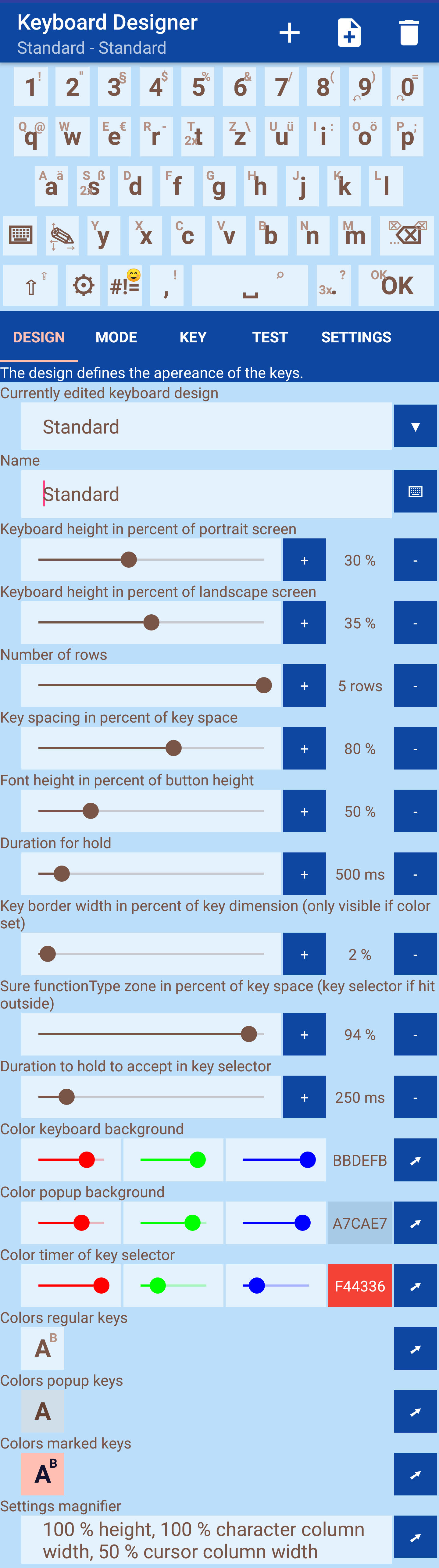
The designer is structured in three areas. At the top you can see the preview of the keyboard and in the middle area the elements to be edited can be selected via tabs. The properties of the elements can be adjusted below.
Each design gets a name that is not visible when using the keyboard, but is necessary for editing. This can be entered in the first field. The design to be edited can then be selected in the selection list.
The height of the keyboard is set in percent compared to screen height. A distinction is made between portrait and landscape mode.
The number of lines determines how many rows of keys are visible. The number of lines and the number of buttons within a line are used to calculate the size of the key area. The percentage value defines how large the key should be within the key area. The font size is then specified in relation to the key size.
To distinguish whether a key is pressed or held, the holding period can be specified.
If borders are to be drawn around the buttons, the width must be determined in the design. Whether a border is displayed depends on the coloring of the buttons (see below).
Â
The sure type zone indicates how large the area of the key is, assuming that the right key was hit (as seen from the center). If the key outside this range is pressed during entry, a selection of the surrounding keys is displayed and the correct key can be selected.
You can set colors for regular, pressed, and popup keys. Pressing the sample key opens the key color editor. For each key, the background, the main symbol color (action pressed) and the sub-symbol color (all other actions) can be defined. If desired, border colors can also be selected for top, right, bottom and left - this requires setting the appropriate hook and determining the color.
The design also sets the colors for the backgrounds of the keyboard and popups. If it is not sure which key was pressed when you entered it, a key selection is displayed that requires you to press a key for a certain amount of time. The holding duration is indicated by a circle whose color can also be determined here.
Finally, the properties of the magnifier can be set. Since these are very extensive, the instructions can be found on a separate page.
To create a new design press the plus icon. The trash icon can be used to clear a design - but only if one of its modes is not defined as default and is not referenced by a key with the Switch Design and Mode function.
You can also create designs from templates. To do this press the template icon, select the template and press "OK".
The next tab contains the modes